Input data is accessed by using aliases. The user selects a table name and specifies the alias. If column selection from the table is ambiguous, additionally column usage has to be specified. The information about the input data is stored in a Data object and can be used to create multiple charts with the same data requirements
The constructor for the Data object has the following syntax:
Data(tableName[, dataSpecification][, nominal = columnList][, numeric = columnList)
The dataSpecification parameter is a Python list, which specifies how to interpret the data. See the examples in the sections below.
The nominal and numeric column lists are used to force the treatment of a chosen column as if it was of the specified type. Both parameters get their values as name lists, where the user specifies which columns have to be set to nominal or numerical type.
The Chart library has to decide how to interpret particular columns and rows in the provided data. The user can decide whether it should be done automatically by the chart library or this information should be set manually.
In case when data types cannot be obtained, automatic introspection cannot be used. For example, consider the following data table:
table '3col':
	a b  c
	1 2 0.3
	2 1 0.1
	3 3 0.2
	4 2 0.15
One of the possible data interpretations is that every row represents a point in a 3-dimensional space.

Another interpretation might be that each row contains two data series 'b' and 'c' for a single value 'a'
This example shows that there is no obvious interpretation for the columns in this table. It is the user's responsibility to specify, how to interpret the data.
Example 11.1. Declaring column types
Lets assume that we want to display 2D data with a data series number. The table consists of three columns, and the third one contains the number of the data series.
In this case the type of the third column data has to be specified as nominal. Automatic introspection process will not guess that this numerical column should be treated as nominal!.
table 'sample':
	n1   n2   n3
	0.3  0.1  10
	0.1  0.2  10
	0.15 0.1  15
	0.05 0.4  10
	0.02 0.3  15

d = Data('sample', [ 'n3', 'n2', 'n1' ], nominal=['n3'])
When the user does not provide the data type, an automatic process is employed. The chart library can determine provided data type if column types from dataset match only to one regular expression (CNN, [N,N]+, etc.)
In the case when the user does not provides any arguments describing the columns for a Data object, the program tries to automatically determine which expression offered by the system is best suited for the data. At first it checks column data types, next it considers all possible column set interpretations. If only one expression fits the provided data, it will be used, otherwise a message is sent to the user that he must manually determine the order and interpretation of the columns.
This section describes all possible formats for the dataSpecification parameter of the Data object constructor.
Notation
- N
Numerical variable name, should be placed between ' or " quotes
- C
Nominal (categorical) variable name, should be placed between ' or " quotes
- [ items ]
Brackets are used to create lists (Gython syntax)
- ,
Separates individual items in a list
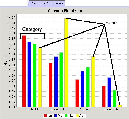
Terminology: category vs. series
The chart below shows what is understood by the terms 'category' and 'series' in this subsection.
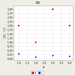
- Description:
Each record will be treated as a two dimensional point from the series specified in the C column. The first N column will be the x coordinate and second the y coordinate.
- Comptible chart types
2D
- Example:
Data('sample_table', ['gender', 'age', 'weight'])
- Description:
Each table row represents series of variable pairs. The number of pairs is equal to the number of series. The first value from each pair will be treated as the x coordinate and the second as the y coordinate.
- Compatible chart types:
2D
- Examples:
Data('sample_table', [['age', 'weight'], ['age_serie2', 'weight_after']])
Data('sample_table', ['age', 'weight'])
- Description:
Each table row represents a data series. The number of series is equal to the number of columns. The first column will be treated as the x coordinate and the rest as y coordinates for the consecutive series. The names of series will be the same as column names in the internal bracket.
- Compatible chart types:
2D
- Example:
Data('sample_table', ['age', ['weight_before', 'weight_after']])
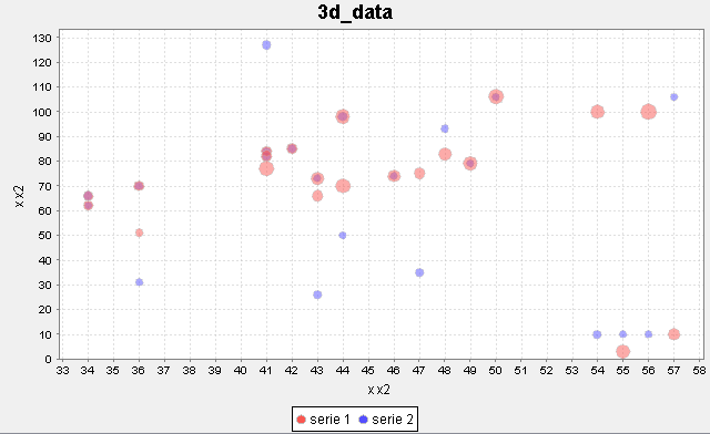
- Description:
Each table row represents 3D variables. The number of these variables is equal to the number of series. The first value from a 3D set will be treated as the x coordinate, the second as y and third as z.
- Compatible chart types:
3D
Example 11.2. Bubble plot with [N, N, N], [N, N, N] data specification (2 series)
table '3d_data':
    x y z                 x2 y2 z2
    48 83 5.34          48 93 3.34
    41 84 4.23          41 84 3.23
    50 106 6.27         50 106 3.27
    41 82 4.77          41 82 3.77
    44 70 6.15          44 50 3.15
    57 10 5.16          57 106 3.16
    43 73 5.19          43 73 3.19
    43 66 4.71          43 26 3.71
    34 62 4.2           34 62 3.2
    44 98 5.91          44 98 3.91
    36 70 4.29          36 70 3.29
    34 66 4.08          34 66 3.8
    46 74 5.13          46 74 3.13
    42 85 4.32          42 85 3.32
    49 79 6.09          49 79 3.09
    55 03 6.03          55 10 3.03
    36 51 3.27          36 31 3.27
    41 77 5.91          41 127 3.91
    54 100 5.58         54 10 3.58
    56 100 6.45         56 10 3.45
    47 75 4.59          47 35 3.59

d = Data('3d_data', [['x', 'y', 'z'], ['x2', 'y2', 'z2']])
BubblePlot(d).show()
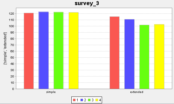
- Description:
Each table record sets the N value for the series specified by the first C value and the category specified by the second C value.
- Compatible chart types:
Nominal
Example 11.3. Category plot with CCN data specification
table 'survey':
	day          experiment_type       measured_value
    'day1'           'simple'           121.1
    'day2'           'simple'           122.8
    'day3'           'simple'           122.3
    'day4'           'simple'           122.1
    'day1'           'extended'         115.4
    'day2'           'extended'         111.2
    'day3'           'extended'         101.9
    'day4'           'extended'         102.7

d = Data('survey', ['experiment_type', 'day', 'measured_value'])
CategoryPlot(d).show()

- Description:
Each table record adds a series of value N to the category specified by the C value.
Each table column will be represented on the chart as a category with the same name.
- Compatible chart groups:
Nominal data charts

- Description:
Each record is treated as a new data series, the name of which is given by the ordinal number of the row in the input table.
Each column corresponds to a separate category with the same name.
- Compatible chart types:
Nominal
It is possible to merge several categorical columns into one. This is done by concatenating string values from each column into one string. The values are merged using the '_' character. This ability is called series grouping. Whenever a categorical attribute name can be placed in a Data statement, a grouped attribute can be also placed.
C can be treated as equal to (C,C,...C). Thus, everwhere where C exists, it can be replaced by (C,C,...C), i.e. in the notation below it is assumed that
C = (C, C, .. C)
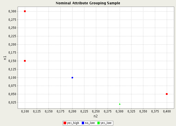
Assume that there are two columns: A and B, the values in each column are: A = { 'yes', 'no' } , B = { 'high', 'low' }. (A, B) can be placed instead of A, and it will be treated as single attribute with the possible values: A_B = { 'yes_high', 'yes_low', 'no_high', 'no_low' }
Example 11.6. Series grouping
table 'series_grouping_example':
    n1   n2    A       B
    0.3  0.1  'yes'  'high'
    0.1  0.2  'no'   'low'
    0.15 0.1  'yes'  'high'
    0.05 0.4  'yes'  'high'
    0.02 0.3  'yes'  'low'

d = Data('series_grouping_example', [ ( 'A', 'B' ), 'n2', 'n1'] )
ScatterPlot(d).show()
The script creates an object of categorical data with 3 data series yes_high, no_low, yes_low as shown on the chart below.
In many cases the input data is inconsistent. This subsection describes how such incosistencies are treated when creating Data objects for plotting.